The case for an open design system
This article is the first of a three-part series that takes a deep dive into Workday’s experience developing, productizing, and eventually, releasing their design system out into the open. Check out Part I, Design Systems are everybody's business, and Part II, Productizing your design system.
The heart of any design system is the community built around it. This is the underlying engine that powers the Workday Canvas Design System with our community defined by transparency and inclusion. In other words: we strive to be open.

In this article, we’ll go over what “being open” means, both as a vision and what is actually happening today at Workday. We’ll also explore tangible examples showing why being open matters and how we’ve benefited from it.
Moving toward openness
Our design system wasn’t always an “open” concept and we can argue that at its infancy, most design systems shouldn’t be. They are ideas and concepts that need to be protected and nurtured until just the right time. Canvas took plenty of behind-the-scenes work to get it off the ground (you can read about this in part 2 of our series) but as adoption increased, we needed to be more transparent about our decisions and open up the system to new ideas from our users.
Our journey toward being completely open is continuous. Yet, in the relatively brief time that we’ve been doing this, we’ve observed three important lessons that we want to share with you:
- Access stimulates progress
- Working openly promotes communication and accountability
- Slowing down first allows us to speed up later
Access stimulates progress
Do you ever get stuck on an idea? Whether it is writing code or creating designs, making progress can be as simple as considering a different perspective. This can come in the form of a customer insight that reveals a fresh take on a stale problem. It can be a poignant observation from a trusted colleague. It can even be as simple as taking a walk through nature (seriously). New perspectives seem to kickstart our brains.
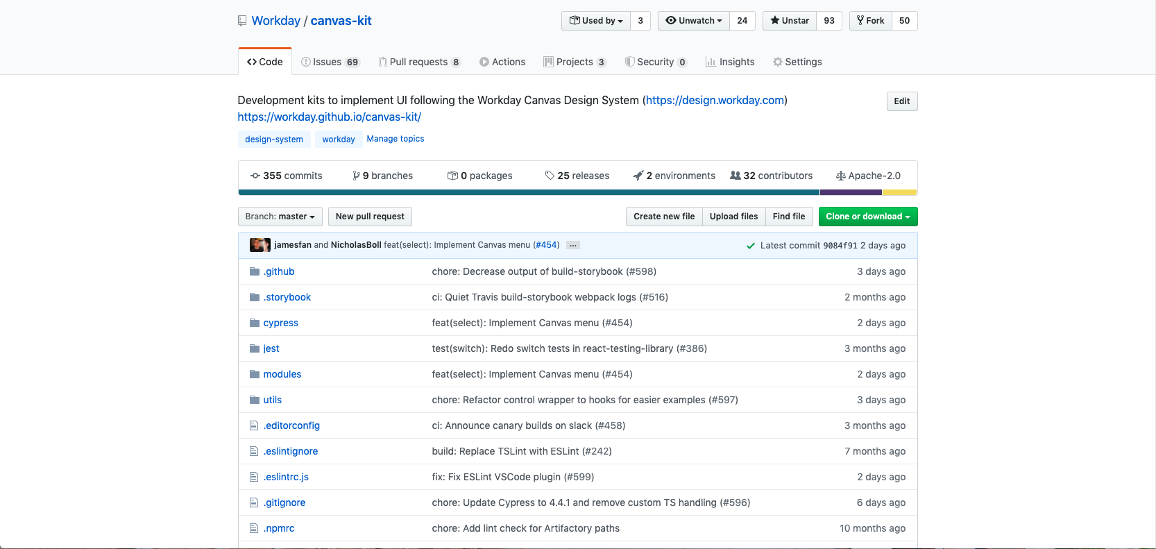
For us, seeking new perspectives took the form of increasing access to our design system. We did this in two big ways: first, we switched our product design tools to Figma, a cloud-based platform; and second, we migrated our developer libraries (Canvas Kit) to Github.com so that our source code could be accessed by anyone at any time. The result is that, by design, many more teams can see what we’re up to and their perspectives allow us to make incredible progress very quickly.
Generally speaking, too many opinions can slow a process down. We found that the feedback helped us make better decisions, quicker. Given the vast array of users and products in our suite, edge cases, accessibility, and optimizations on components need a large amount of research and outreach. These requirements now flow into our process as a natural side effect of increasing access to our system.
Imperfections become improvements
A great side effect when increasing access to your design system is that your imperfections become improvements. Even the most mature design systems have flaws. At Workday, we have had to address missing/incompatible components in our Figma libraries and fix cross-browser bugs in its codebase. Every time someone brings those to our attention, we get better. Since we open-sourced Canvas Kit in July 2019 we’ve fixed more than 90 reported bugs in our codebase. Many of those were solved by contributors outside of our own team. Additionally, since we switched to Figma, our internal Canvas community on Slack has more than doubled. That community alerts us to at least one inconsistency within our design system every week. As designers, we’re often conditioned to hide our flaws so that we can present a polished product. Ignore that urge. This doesn’t work when it comes to design systems because they serve as a foundation for product design. The faster we are able to discover its imperfections, the faster we can improve the platform that our community depends on.
Development becomes diverse

Building a truly scalable design system is a near-impossible task for any singular team. Consider all the deep expertise that goes into the design, development, accessibility, internationalization, and testing of it. It can be daunting, to say the least. It’s important for us to leverage the subject matter experts around us to make the design system and all its parts work for everyone. We achieve this by being open. For example, our accessibility gurus conduct regular audits on new and existing components knowing that our latest and greatest code is available for them to look at any time.
By no means are we advocating that simply being a more open design system will resolve your issues through crowd-sourcing. But we are saying that in an open design system, its development becomes diverse. The true value of this is the way we are able to multiply the impact of these diverse viewpoints through the design system. Teams who may have had limited access to these subject matter experts (SMEs) now indirectly have their expertise added to their products through the design system’s components, Figma libraries, and documentation.
Scrutiny becomes sustainability
If “being more open” sounds like you’ll be inviting a lot of scrutiny, it’s because it will. But in an open design system scrutiny becomes sustainability. By opening our design system to the world, we’re inviting opinions about how we do things and can also highlight the things we don’t do quite right. Things change when you’re official.
To consider this, we’ve implemented plenty of guardrails like visual regression testing across all of our supported browsers and formal design documentation processes largely because many teams watch our every move. Yet this scrutiny works in our favor and we’ve made incredible progress on being a more sustainable, better-documented design system.
How open you can be with your design system’s access largely depends on your organization’s goals but we recommend that you strive to be open to as many diverse perspectives as you can. We have found that if we take the time to grow and build the community through openness and transparency, it encourages contribution. Contribution creates that sense of ownership, but just as importantly it means more people helping the design system grow. Some of the teams we have worked closely with through communication and collaboration are now some of the biggest contributors to our codebase.

Working openly promotes communication
If the community is the heart of a good design system, then open development can be thought of as the arteries and veins: it carries life-sustaining communication principles like clarity, transparency, and accountability around the body and back to the heart. When we talk about “development,” this isn’t just our codebase on Github but also our design specifications and documentation on platforms like Figma and Confluence. Also, all are welcome to participate in our Slack channels and our sprint demos.
Being open is not just about lifting up the veil on our code but also the way we work as a team. The fortnightly demos we hold for our engineering kit go over upcoming changes or newly released features. We cover why these changes were made and ask for feedback. This openness allows users of our design system to see how we decide on changes that will best serve them. It’s kind of like showing your work on your math test. If your teacher sees that your approach to the problem was correct, even if the answer is wrong, they’ll understand your thinking and may give you partial credit.
By being transparent, we try to build with the community and the developers using our codebase. Before going open source, this approach also helped us build trust inside our organization.
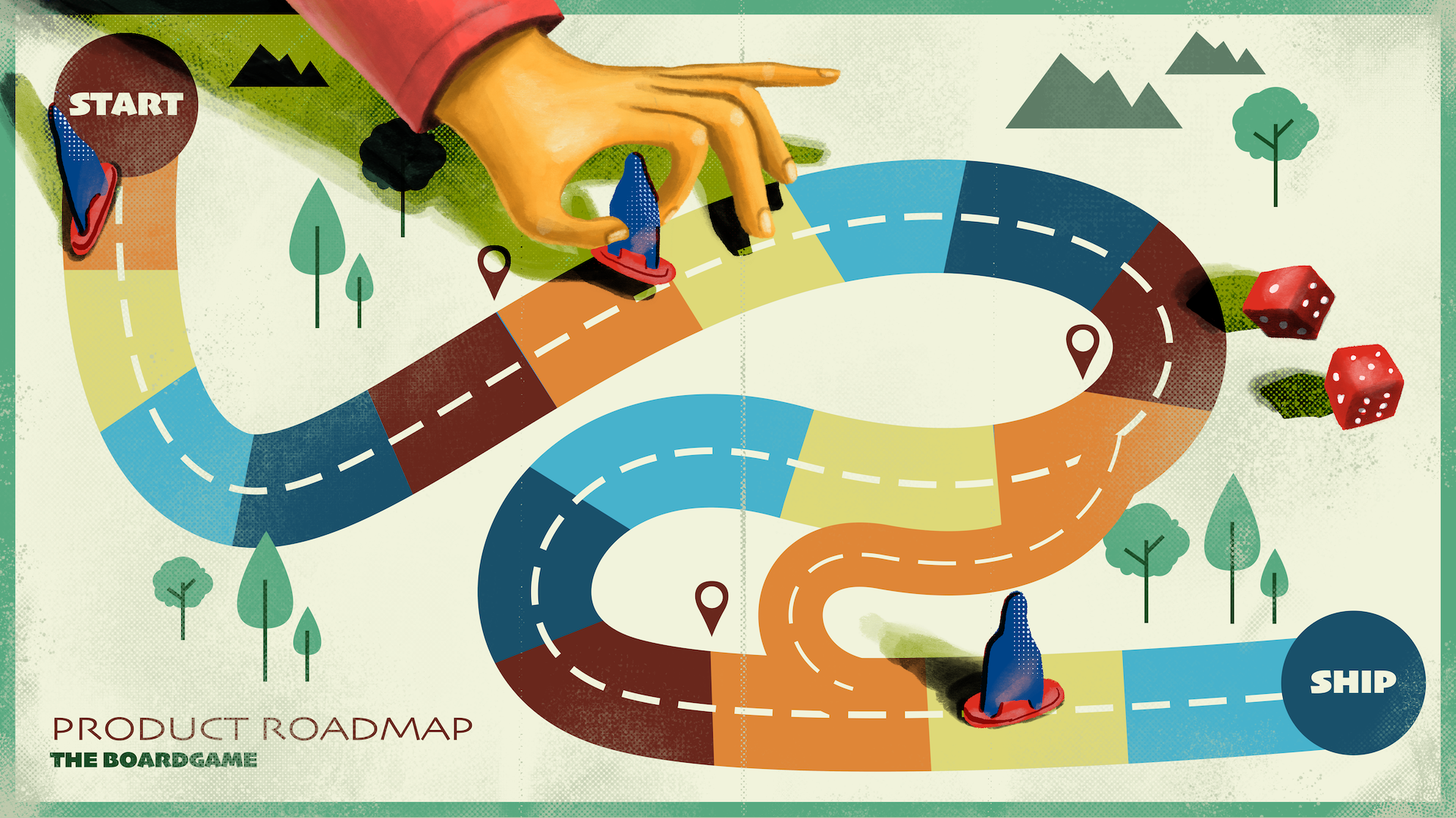
While we strive to be as open as we can to as many people as possible, it does produce an interesting side-effect: open development forces us to be accountable. As more teams at Workday depend on Canvas, we become beholden to more and more requests, expectations, and results. That’s terrifying. But while accountability can be scary, a healthy dose of fear is a great thing! In 2019, our biggest feature request was a roadmap and a release cadence. Our users want to know what’s coming and when. To accommodate these asks we spun up a read-only Slack channel to let folks know about what we’re up to.
Slowing down allows us to speed up later

Just like any other product, design systems are not immune to debt.
As your system grows, your user base should also grow. After you have a minimum lovable system, further growth should have a balance of speed and quality. We know that iterating fast is important to give value to your users. But, considering how a change could impact your users and the system itself is even more important.
For our design system, changes to the way a component interacts with other components is a concrete example of a breaking change. It must be carefully managed and communicated. However, this also extends past the technical changes to visual breaking changes. Changing a button color or increasing the height of a text input can have wide-sweeping effects. For example, it could change the layout of a page or the application as a whole. In turn, this may affect components and interactions around it, break tests, or even require an update to documentation. These changes have the potential to create friction when adopting a design system. Friction is inevitable, but a release cadence can help ease the burn.
We’ve introduced mechanisms to communicate planned changes through change logs. We note everything from the update of a library dependency to a visual breaking change. Through semantic versioning, we bundle breaking changes into major releases. This allows us to easily communicate changes to our users.
Although we have processes in place, we are still refining our approach to visual breaking changes. Our aim is that our changes are well understood. Coupled with the right communication channels, a team’s upgrade path should be clear, reducing the friction of change.
We continue to work on the frequency of our major version releases. We’re looking at how we can align visual evolution to the Workday product releases. For us, this is twice a year. Aligning to this cadence means we can use internal processes around change management for our customers. But, it's good to note that we do not need to align technical breaking changes with this cadence.
Being open amplifies the impact of a design system
Yes, there are considerations to building an open design system. But for us, the benefits have allowed us to nurture a community of open design.
By slowing down our rate of change, we’ve been able to increase the impact of our design system as we move forward.
Being open creates transparency for how and why we do things. This transparency allows us to come full circle. It allows us to iterate faster and deliver more value to the teams using our design system, and at the end of the day, empower them to deliver quality and cohesive experiences to their users.