The future of design systems is complicated
We talked to several industry experts about how they’re managing the future of design systems—from tooling to automation to accessibility.

Great (app) expectations
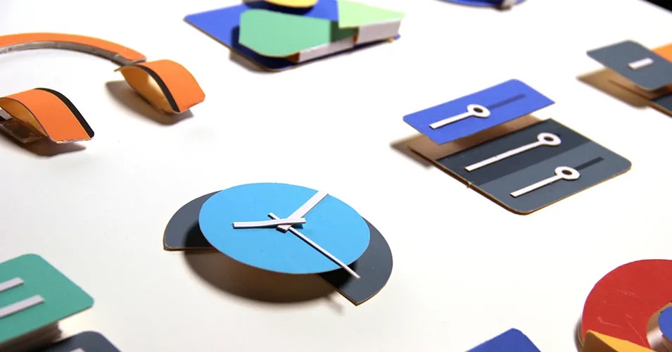
When Google debuted its Material Design system in 2014, the team used paper as a metaphor: Digital elements were stacked, like sheets of paper on a desk might be, affording users a visual cue to sift and sort through information intuitively. “Material has physical surfaces and edges. Seams and shadows provide meaning about what you can touch,” explained VP of Design Matías Duarte. At the time, Material was just one of a spate of revamped digital design systems that emerged in the early ’10s. These systems took into account users' visual and technological sophistication—long gone was the need for a fully skeuomorphic experience to guide people along their journey. People saw it and understood.

Nearly a decade later, Google has abandoned the paper metaphor, citing the expanding computing landscape as the reason for the shift. In other words: People no longer need a visual metaphor. Our collective understanding and expectation of how to navigate digital experiences has expanded, and, with it, the complexity of experiences our design systems need to accommodate—new form factors, affordances, accessibility standards, and performance expectations. And all this is on top of a certain level of aesthetic freshness and excitement we need to maintain.
Two years after Apple moved on from skeuomorphism, Instagram swapped out its three-dimensional camera icon for a flat one on a colorful gradient. The aesthetic change also reflected a shift in the company’s priorities: Instagram was more than a photo-sharing app. In the following years, the app introduced features for discovery, sponsored content and partnerships, improved accessibility, and shopping. Such expanding use cases are commonplace; it’s rare to encounter an app that just does one thing. (Just look at WeChat.) Apps are expected to do more and do better. Similarly, their users (and their individual needs) are considered more sophisticated and complex.
“Today, design is more complicated, often encompassing larger teams working together on multiple, interconnected systems,” says Figma product manager Jacob Miller in his essay Taking cues from code. “This requires better solutions to organize and make sense of it all.” Design and development teams will need to continue to work in parallel, and find new ways to meet their users' great expectations.
Taming chaos with structure
Miller sees a trend in structure-driven solutions to tame the chaos, with design teams applying processes and frameworks borrowed from code. Branching and merging, a system-driven workflow widely used in the developer community, is a popular trend in design systems. The practice allows teams to build with their communities by enabling contributors to work on isolated branches without affecting the primary system. These contributors can submit fixes or suggest new components, then have design system managers review changes before adopting them into the system.
Spotify’s Encore encourages sub-teams to fork and build on top of their system in what they’ve been calling local systems. This has led to a robust collection of video players from their ads team, which informed how they approach video across their surfaces—effectively increasing the footprint of their design systems team. Other companies and enterprising individuals open their systems up to the public, allowing anyone to contribute designs or replicate them in their entirety. “Open-source systems can be great for gaining a feedback loop with a wider range of users,” says Louise Macfadyen, a former design advocate on Google’s Material Design team. “It also demystifies the products themselves, raising the organization's profile, while also sharing that knowledge which creates greater trust in the industry as a whole.” (Editor’s note: We’ve updated the open design systems page with several new systems this year.)
Too stiff? Loosen the reins
As structure is applied at scale, however, new problems emerge. When a system becomes too restrictive, the design itself suffers. Designers who find their design system is too constraining complain about a lack of freedom and experimentation. “At the end of the day, our design systems should lower the barrier for creative expression,” says Miller. “Not make it harder.”
Shopify Designer José Torre offers a solution: “Rather than approaching design systems like architecture, we should approach it like gardening.” Unlike architecture, where details are considered, built, and then done, “A gardener plants seeds and tends to them. They know what they planted, but they don’t know exactly what the garden is going to look like. They find out as it grows and intervene when they find weeds, or want to make changes.” Just as a plant may spread in unexpected ways, so too might a button or menu emerge from within a carefully planned design system. That component might also spread—overtaking the garden entirely. Or perhaps a bulb never blooms, or a seedling requires more sun. The gardener—or design systems manager—can make adjustments as needed.
Sub-components or nested components—modular units that let users customize them to suit their needs—offer yet another alternative to the finite atomic model. Matthew Strom, a product design manager at Stripe, sees them as part of a paradigm shift toward a “functional model” of design systems—one where sub-components more closely correspond to actions, or what these elements actually do (say, click, type, input, search). “Sub-components allow for scalability and a new level of efficiency beyond the object-oriented design systems we’ve been building over the past decade,” Strom says. They also allow product teams to plan for an unknown future. “You don't need to anticipate the super-mega-menu you’ll need three years from now. You have all the sub-components, and when that opportunity comes up, you put them together according to the rules of the system. And it just works.”

Another added benefit of nested components: More inputs. More variables mean more metadata, giving design system managers more information on how components are being used. That data could pave the way for new applications in the future. (Say, an AI that generates new components based on existing patterns?) In the nearer term, it's another way for teams to measure the success or shortcomings of their systems. Which is good, because as these systems continue to evolve, teams will need to find new ways to ensure that they’re hitting the mark.
Strike a balance
Knowing whether to add structure or reduce it in a system is tricky. Constraints can be an excellent tool to unlock new ideas. And indeed, designs can become more efficient with a well-structured design system. The desire to codify aspects of a system is strong, and if everything is up for debate, how can a design truly be done? How can designers and developers trust a system that is constantly in flux? As we look ahead, how can teams optimize for both?
Regular reviews and evaluations can ensure they still track as teams build for the future—even if it's hard to predict the shape of complexity that's to come. Like any good product, design systems should solve problems and work towards a clear goal. Building a culture (or process) where participants can contribute ideas, feedback, and even components allows a design systems team to continue to improve and broaden their reach. Miller urges design systems teams to treat their systems like products, checking in with their users to meet their needs. The answer lies with the people using it.
Up next: Automation and tooling. What else are you eager to hear about? Tweet at @figma with your design systems questions and ideas for the future.