The future of design systems is semantic
Variables, one of Figma’s newest features, help you streamline designs and connect more closely to code, but what do they tell us about larger shifts in the industry? We dig into what they might signal for the future of design systems.
 Hero image by Andreas Samuelsson.
There were tons of big moments at Config 2023, but for those working with design systems—whether building them, maintaining them, or using them—one likely stood out from the rest: variables.
Ever since we started supporting design systems, the community has been asking us to bring design tokens capability into Figma. This year, we finally made that wish come true with variables, which deliver on the same use case and more.
But more than just codifying design decisions, variables also literally vary to unlock design theming and dynamic prototyping logic. As reusable and changeable values, this feature goes a step further than tokens in their holistic approach and signal a larger shift in how we design today. So, we sat down with the people working across design systems tooling both inside and outside Figma to understand what the rise of tokens and features like variables mean for the future of design systems.
Token primer
If you're already familiar with tokens, you can skip ahead. If you’re new, check out Design Systems Advocate Jina Anne’s introduction in this video, aptly titled WTF are Design Tokens?
Picture this: You’ve just been tasked with reining in your product’s color palette. The product has been around for a whopping 15 years—relatively unheard of in the app space—and has been touched by quite a few folks before your time. Still, though. How many colors could there really be? Fifty? A hundred? How many colors are there in the world, anyway? Turns out, a lot. When an intrepid team of designers at Google Maps took on a similar project, they discovered that the tool had over 700 colors and, a year later, winnowed that palette down to 25 hues.
That’s impressive, but what keeps them from ballooning back into the many hundreds again? How do you maintain a color system that is meant to encapsulate the entire world? The Google Maps team turned to design tokens as a way to document and distribute their new, more limited palette.
The token origin story
Design tokens—or tokens, for short—have been rattling around the design systems space since early 2014. Tokens are bits of data that represent small, repeatable design decisions such as border radii, sizing, typography, or colors. By separating design properties from specific components or implementation details, they allow for a more versatile, platform-agnostic approach. Elements such as color, number, and string can have multiple values, or tokens, that can be easily updated across a product (or several), reducing redundancy and maintaining consistency wherever they are used. So, if you have to change the color of *all the trees, that change can be made in one place and reflected everywhere else. (Great for managing rising complexity, right?)
Salesforce is widely considered the “design token pioneer.” In a 2014 article published in Salesforce Designer, Salesforce UX Vice President Sönke Rohde described how the company uses design tokens to apply the same design principles across multiple platforms and software. (UXPin, 2022)
“The new color system helps our users better understand the world around them, while aligning it to the Google palette sets us apart and builds brand equity,” says Director of UX Sang Han, who worked on the project. “Because the system is easier to update, it also positions our team to keep moving the brand forward.”
Introducing variables
Like tokens, variables in Figma store reusable values that can be applied across designs. However, their variability inherently broadens their potential for use: In addition to implementing design tokens, variables and modes enable teams to switch designs between different contexts—such as light and dark themes, different languages, or screen sizes. Variables can also reference other variables, making it easier to update all the little details—be that padding, color, radii, or spacing—that exist within a system.
“In my mind, variables is a much broader concept, and tokens are one flavor of that,” says Lauren LoPrete, design systems expert. At Dropbox, her design systems team beta-tested the feature, leveraging it for their token system. She also sees wider applications with regards to localization in its ability to represent various strings, letting users swap between content in multiple languages. More broadly, she says that variables can help free up her team's time by empowering other teams who might want to quickly build and prototype new ideas or implementations.
In my mind, variables is a much broader concept, and tokens are one flavor of that. — Lauren LoPrete, design systems expert
The ability to introduce flexibility—and with that complexity—to design systems (like how the colors of an entire app surface may change in dark mode), means less maintenance for design systems managers. “I’m excited to see a big reduction in the amount of overhead that those managing design systems will need to deal with,” says Tom Lowry, Design Advocate Manager at Figma. “For years, I’ve worked with teams who have tried to solve this with complex multi-library setups, unruly component sets where color modes like light or dark are defined as variants, or even bespoke plugins. Instead, a designer can now work on a UI in dark or light mode depending on their own preference and, at any point in time, switch to see what it looks like in the other mode.”
Closing the gap between design and code
Variables are also communication tools, establishing a shared language between design and development. Design as a whole has been taking cues from code for years, but variables mark yet another step toward minimizing the gap between the two. Additionally, Figma’s REST API, with read and write access for variables, and Plugin API open the doors for a variety of ways to connect variables in Figma to tokens in code, even bidirectionally—from querying and reading to creating and deleting, as well as binding them to components.

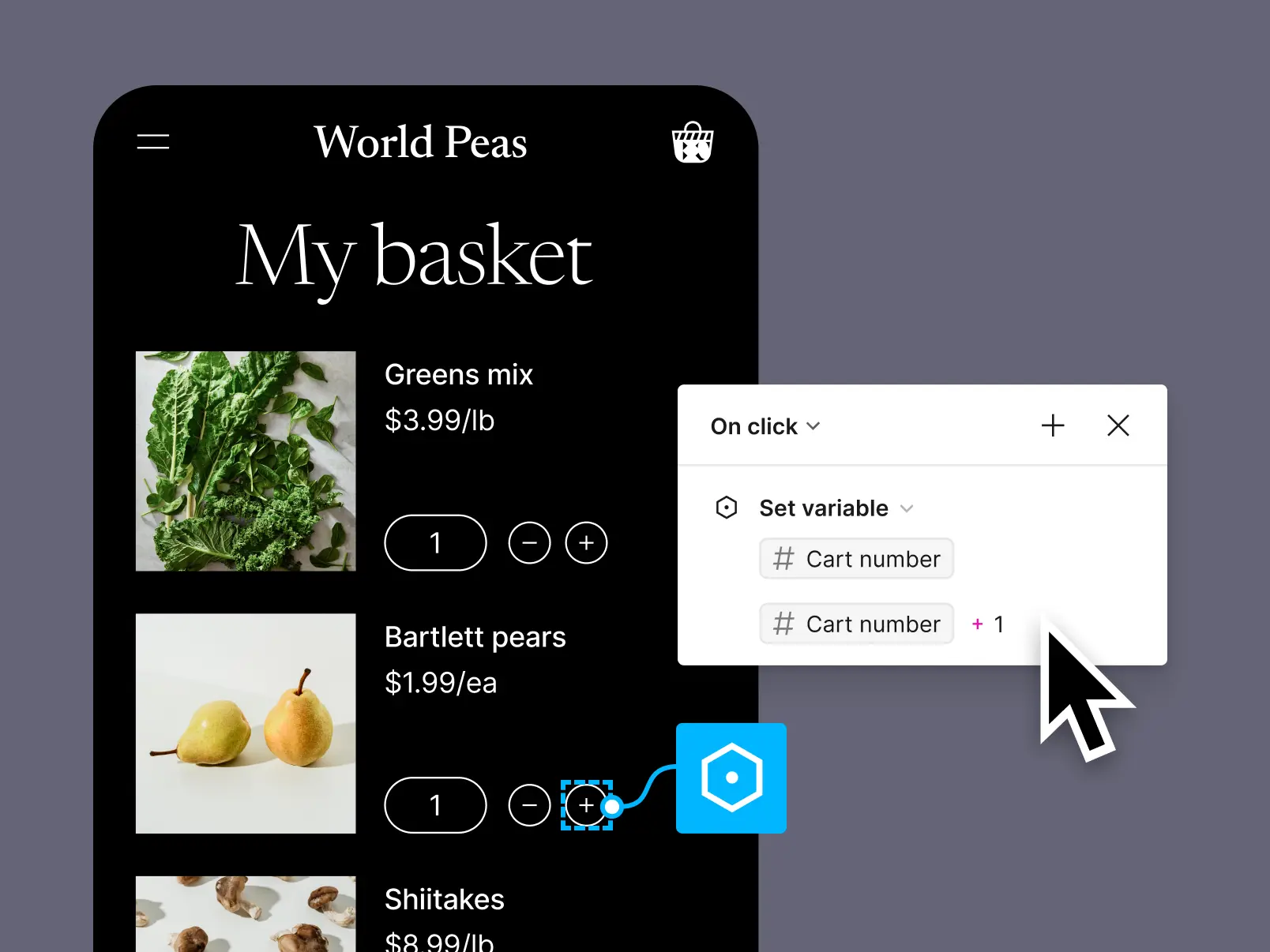
Perhaps the most direct example of that narrowing gap exists in Figma’s new prototyping capabilities, enabled by variables. Variable values can be set and modified with prototyping actions to create fully functional prototypes that respond to user input. The stored values can be combined with expressions to generate dynamic string values, perform basic math operations with number values, or evaluate boolean expressions—similar to code. But, of course, without the code. This breaks down barriers so that anyone familiar with the feature can build a successful prototype, test their ideas, and gather the necessary feedback to evaluate if it’s worth building.
“One of our design team’s principles is to empower creativity through flexibility,” shares Lauren. “Before variables, our system was so rigid that consumers weren't able to manipulate it in a way that wouldn't break the system completely or revert to a hard-coded solution. Variables helped us introduce more flexibility, so we can hand over some of the keys of that system to the people actually making the products.” She cites one example where her team was able to give their Growth team a playground with variables to A/B test different calls-to-action and pop-up colors, in order to optimize for their own goals.
A/B testing (also known as bucket testing, split-run testing, or split testing) is a user experience research methodology consisting of a randomized experiment that usually involves two variants (A and B).
While the concept of the linear product design process with clean handoffs (or high-fives) has long been something of a myth, those loosely defined phases will continue to collapse further into themselves and into each other. “It still feels like there's a fence that you throw your work over and an engineer picks it up on the other side,” says Lauren. “I’d like to see that get to a place where it's a much more collaborative or shared process.” As design and code drift towards each other, roles and swim-lanes will blur together. Soon, steps might be skipped or eliminated entirely. Teams, collectively, will ship more, faster.
We don’t know what the future holds, but with the rise of AI, many in the community are wondering what types of processes might be automated entirely. “I wish I knew the future so that I could help guide my clients in those directions,” says Nathan Curtis, design systems architect and founder of the UX firm EightShapes. “But I will say this: I've designed a button far more times than I would like to admit. I've designed token taxonomies, what, 30 or 40 times and they all tend to have an action-color group and an alert-color group. They all have the same basic taxonomy choices and, sure, there are devilish things in the details, but broadly they're the same patterns. So from that perspective, I don't anticipate many people paying me to do token taxonomies five years from now.”
Bringing more people into the process
At the very least, these shifts suggest we’ll start seeing more people from a variety of roles and backgrounds building new products—which is a good thing. “Variables historically are very much a developer concept, and now we're putting this interface around it that makes it more accessible for more people to be involved in that process,” says Tom. “It's not exclusive to design systems people working on design systems. We've expanded the utility to where a content designer can come in and define terminology.”
And as Lauren adds, we need different people to participate in the process—because the people who might have been great for spinning up or establishing a system might not be the same people who are great at maintaining, evolving, or driving adoption of that system. “You need a different set of skills,” she says. Her design system team at Dropbox includes technologists who prototype components, build them in React, and test them in code—alongside designers who focus on community and collaboration models, as well as operations people who ensure adoption and maintain feedback loops in service of the whole design organization.
 To get started with variables, check out this Intro to Variables on YouTube, Deep Dive with Jacob & Luis, or our Guide to variables in Figma.
One small step for design systems managers…
For now, there’s still a long way to go. “There's a really interesting opportunity to build more content design systems within the system, especially with the rise of AI-powered tools like Ditto,” says Lauren. “I'm really passionate about getting more voice and tone style guides into the tool where our consumers are. So the more best practices we can have built into Figma, the more productive our designers can be.”
Nathan covers a range of design systems topics on his Medium—from design tokens and visual style to contributions, documentation, and planning.
Nathan agrees: “I see documentation websites diminishing, as more products like Figma that incorporate design systems provide that natively within the app. Over time, I anticipate more and more systems-oriented docs embedded within a tool like Figma so that people need not leave to go to a site to learn how to use things or make the right decision.”
“The vision [for variables] is much broader than what's supported today,” says Tom. “Any design decision that can be reused could be a variable, whether or not that fits in the scope of design tokens.” He cites localization (echoing Lauren’s point above) as one example, currently solved with tokens, but that opens the door for new approaches to standardizing language that could help teams make more informed decisions. Instead of wondering what a button should say, a team could pull up their content library where all product terms are defined, review all other ‘calls to action,’ and have a meaningful conversation about the role of the string in a particular use case.
The same goes for animation, typography, or any other design decision. “While we don't support this today, in the future, you might have a variable that supports an easing curve that could change based on use, say for an alert versus something more transactional,” says Tom. “Could you use variables within other variables? Could you create expressions that make a calculation based on variables for a value? Like a saturation function that consumes a variable from your system? There are so many ways that variables could help us create more complex, more dynamic designs. This is the start. We're not done.”
Let us know what you think and your predictions for the future of design systems on Twitter!