Why we build design systems: an agency's perspective
A digital brand and product innovation company.
Instrument is a digital brand and experience innovation company headquartered in Portland, Oregon. In partnership with companies like Nike, Google, Airbnb, Sonos, and LinkedIn, we take on product design, new tech innovation, branding, marketing, strategy — the works.
Typically, clients partner with Instrument in times of transition: rebranding, new growth opportunities, etc. Our outsider’s perspective is valuable in these cases and allows us to solve tough problems in unexpected ways. Often, this means going above and beyond a simple website redesign; rather than a one-off solve, we prefer to deliver a complete design system. This gives the client the ingredients and the recipe, rather than a single prepared meal. They can then reuse the functional components we’ve created across myriad applications and at scale.
Close collaboration with clients
Since design systems are still an emerging methodology, it’s usually incumbent on us to identify scenarios where they’re needed. This is one of our primary ways of adding value to the partnerships we have with our clients. It also involves insightful, strategic thinking to work from the initial ask (e.g. a new website) to the deeper issue and longer-term solution.
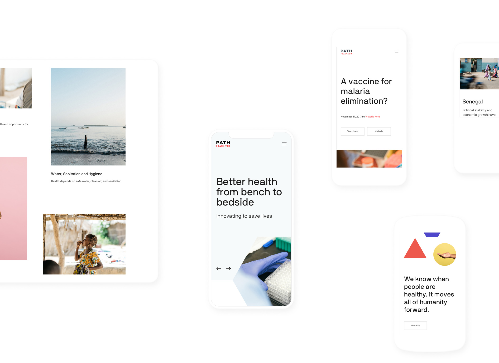
Creating a design system is a highly collaborative process that embeds us with our contacts on the client side since it requires education about design systems as a concept and training on how to use it moving forward. Our primary goal is always extensibility, so we assemble a detailed guidebook for how to recreate and expand Instrument’s work, both technically and aesthetically. Perhaps the most extensible system we introduced was for PATH, a global NGO that provides a publishing platform for health professionals across six continents. PATH’s design system furnishes these dedicated people with templates, a style guide, and a massive bank of photography, allowing them to publish their research and accomplishments from anywhere, and maintain the look and feel of everything PATH produces, and to do so directly from the field.

Aligning internal teams
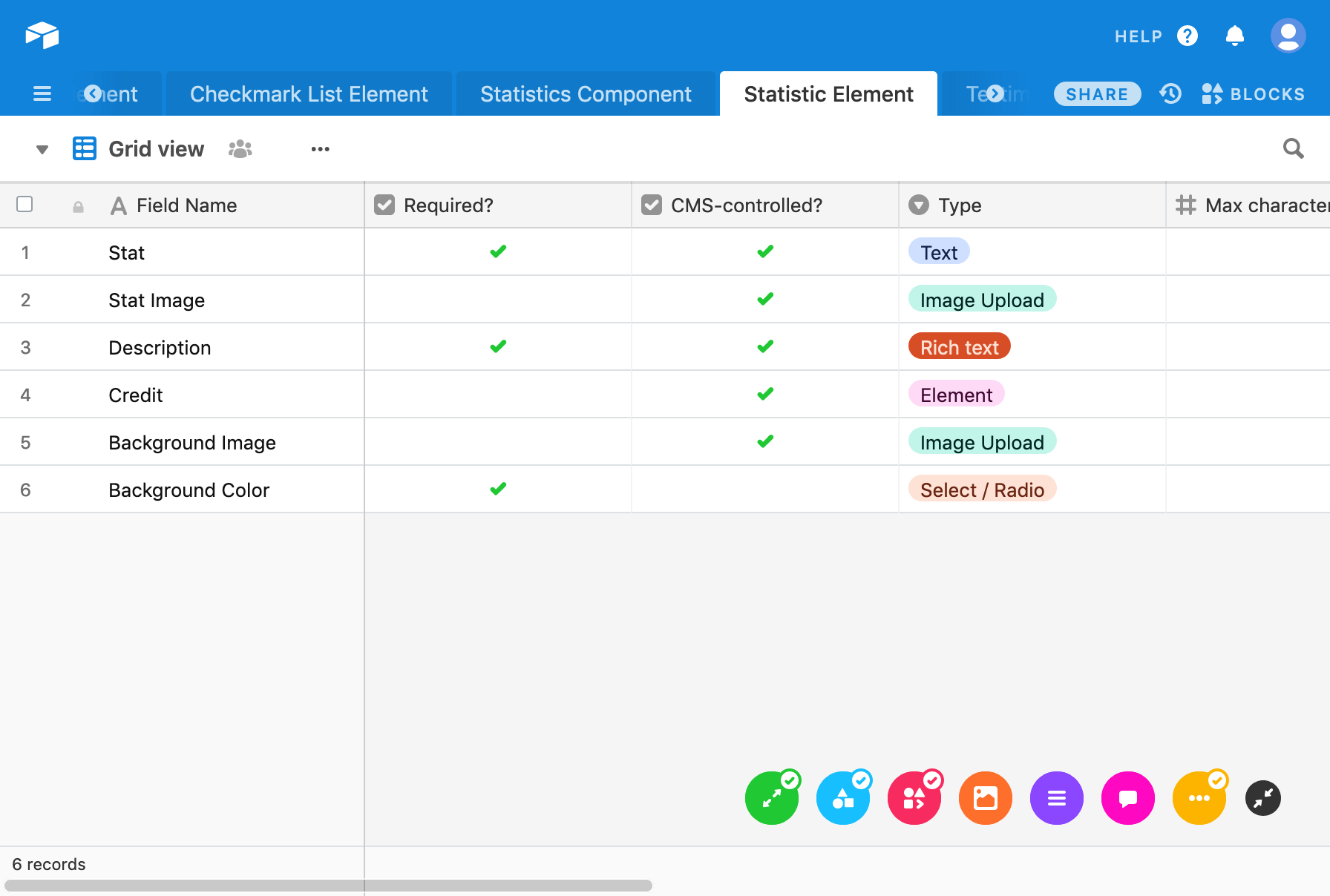
Beyond the traditional design system library, our client collaborations sometimes include integration with internal teams to co-create and implement fully developed component libraries. This requires our designers and developers to work iteratively to build elements and components as fast as possible. After a round of content strategy, we typically know enough about functionality and requirements to take components into code — even if it’s a little rudimentary. We achieve this by using tools like Figma to break down the walls between disciplines and track dev requirements for components in Github or Airtable. When everyone can see and tweak and try, the communication between dev and design becomes second nature. We also love to get designers into Github, reviewing PRs along with dev as components are developed. Once things are stable within our team — when we understand how we’re collaborating and building together — a platform like Netlify lets us share builds of components and pages easily with clients, so that everyone has access to the latest in code as quickly as they have access to the designs.

All our work points us toward richer understanding, stronger collaboration, and more fruitful co-creation with our clients and between each other.
Supporting the org
We also care deeply about longevity, supporting internal teams, and helping content producers do their jobs better — all goals that are well-served by a design system. To meet these goals, it’s imperative for Instrument to be integrated into interdisciplinary internal teams, and that we have access to key stakeholders. This access is required as part of our engagement — we write it into our scope of work — and we engage with our client-collaborators in an immersive on-site kickoff. We’re not shy about introducing new parties to projects. We carve out time to bring them fully up to speed, making sure they’re communicative and available for the duration of our work. In short, we do anything and everything we can to ensure thorough integration with our client-side teams. It leads to better work.
Sometimes it’s challenging. Issues of alignment cause trouble when client-side teams aren’t communicating fully among themselves, or when they don’t see eye-to-eye on user goals. More problems surface if open access is lacking, like when content producers aren’t able to efficiently access a CMS.
We know that for a design system to work long-term, these challenges need to be addressed. We’re always keeping these things in mind, and working however we can to support and advise our clients on creating the healthiest environment possible for the system to succeed. One key part of this approach is openness. We request to have multiple disciplines and levels of client-collaborators present in reviews and during our project kickoffs. We aren’t precious about who has access to briefs, demos, and prototypes (except when private, of course). We also work proactively to help our client contacts evangelize our collaborative thinking up and down the chain, contextualizing the system for everyone from internal designers to the C-suite. We develop this context over the course of the project, creating strategic approach and design presentations that our clients can take ownership of and share across their organizations after Instrument’s work is complete.
An evolving process
Every project is a learning experience. Though our process is feeling mature, we’re always looking for ways to improve both internal collaboration and the end-product we deliver to our clients. These deliverables always vary; there is no formula. If one client needs guidelines on creating website asset photography, we’ll create them. If another client needs robust definitions of the strategy behind their components, we’ll write them. Each time, we better target these assets to our clients and their needs, and try to do it faster, with better communication between design, strategy, and development. We always ask ourselves and our clients in post-mortem: What could we have done a better job of delivering, and what could have been clearer? And we always check in on systems down the road to see how things are being used and to see what we can learn.
Ultimately, design systems are about improving a company or organization’s digital presence, and helping make day-to-day work easier for their internal teams. Even if it’s not precisely what our clients are after when they hire us, it’s the best possible tool to leave them with once our collaboration concludes. We see each project as a chance to positively influence a company’s future, and we’re grateful for every opportunity.